Which colors work best for social media images?
Standing out on social media will decide whether a follower or consumer engages with your brand.
Color is one such tool that can be used to make our posts more noticeable in our social media feeds.
Regarding social media, telling what works can always be problematic.
What appeals to one person may turn off another, even if our personality traits align.
Besides, when everyone follows what others do, standing out becomes even harder and people begin to switch off.
“The best color in the whole world is the one that looks good on you.” – Coco Chanel
Color context
Whether Facebook, Pinterest, or Instagram, you will need to consider which colors are harmonious with the platform you are posting on.
When posting, will your image stand out amongst the other pictures and videos, or will it be lost in a sea of content?
Working on your color contrast is a way to avoid your pictures becoming lost on social media platforms.
Color contrast is most striking when it is between dark and light colors, namely black and white. Beware though, black and white do not work so effectively on social media, nor websites in general.
To make your social media images really stand out, you should consider:
- Which social media platform you are posting on. Colors in your visuals can be lost amongst the platform’s own branding (think blue images on Facebook).
- The color psychology behind why brands choose specific colors over another (think green for organic foods and farming/tractors).
Color harmony
It is common practice that brands use a limited color palette rather than using so many. The purpose is that the consumer familiarizes that brand with a specific color palette. Much like red and white are with Coca-Cola.
It does not matter if discussing graphics, billboards, photos, paintings, or social media images.
Plus, the color palette should consist of harmonious colors that work with each other.
Brands, social media managers, graphic designers, and influencers use a color wheel to determine the relationships between each color. Color wheels provide a kind of map, or a guide to how the color palette is selected, concerning:
- Color opposites
- Color similarities
- Tints
- Shades
When viewing a color wheel like below, observe where the colors are located:
Colors that are situated closely are known as analogous colors:
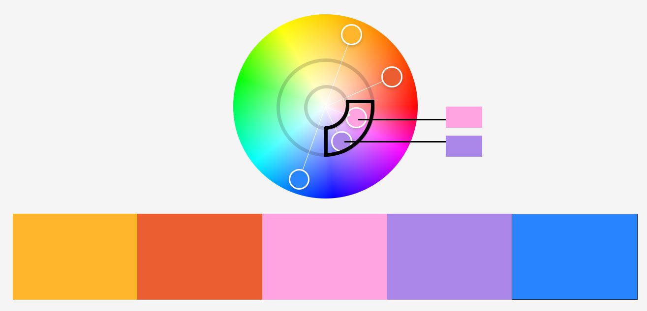
Colors that lie within the same ‘area’ of the color wheel appear visually harmonious, like this :
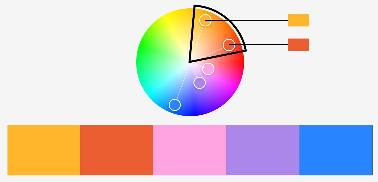
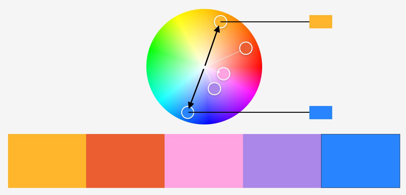
Colors that lay opposite one another (in different areas and rings) on a color wheel appear to clash in a high-energy way, like these:
Use the free Adobe Color Wheel tool for creating color themes like these.
Best colors for social media images
Facebook: Lively, vivid and bright colors
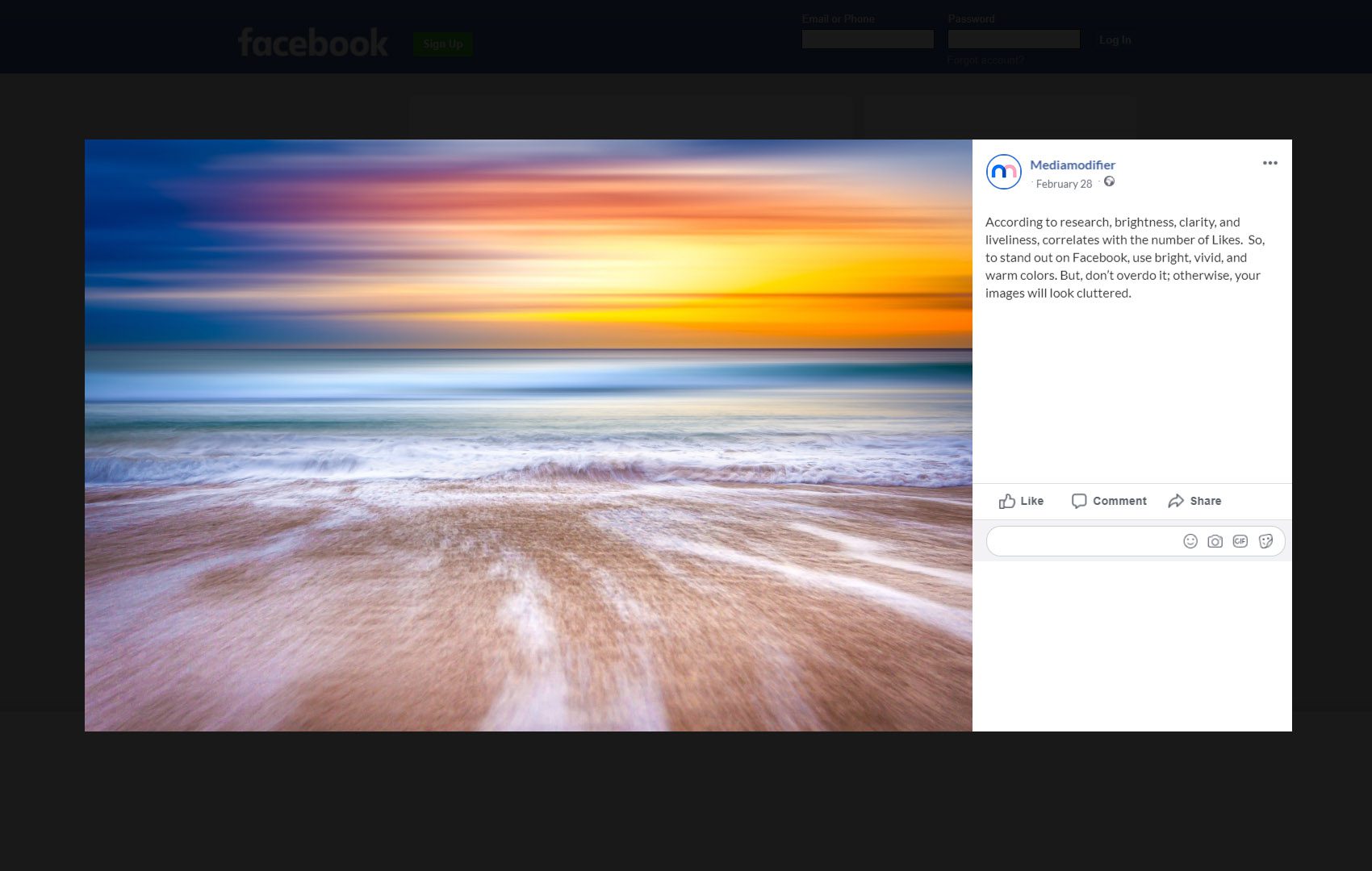
According to research, using bright, clear, and energetic colors increase Facebook ‘Likes.’
To make colors more noticeable on Facebook, you should use warmer complementary colors. But, don’t overdo it; otherwise, your images will look cluttered.
As you have probably guessed, blue does not help you stand out on Facebook because Facebook’s branding is blue itself. If you need to use blue because it is part of your branding, then combine with a warm color to your social media images.
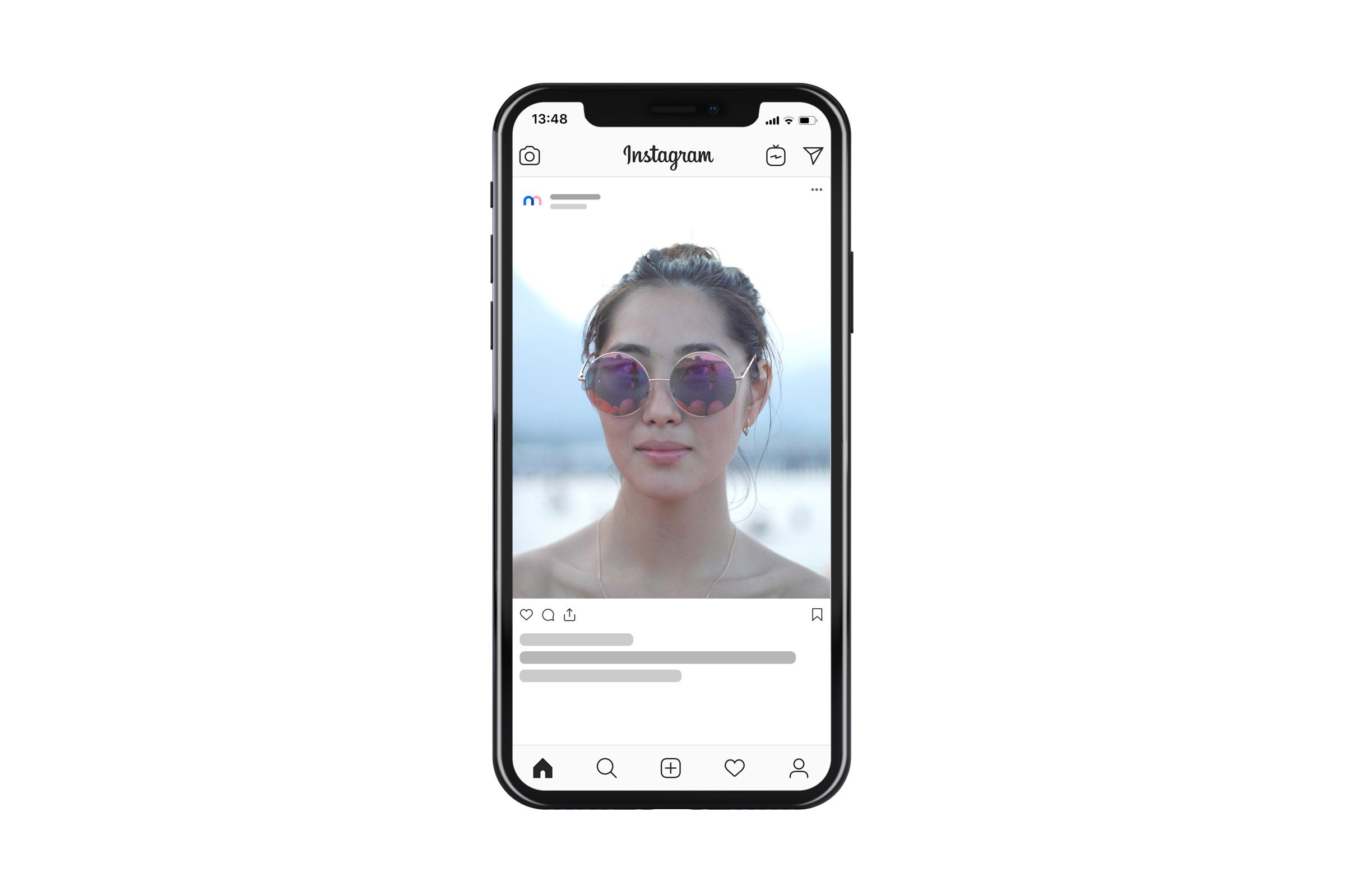
Instagram: Light colors, white space, and textures
According to research from Curalate, Instagram photos tend to work better when:
- Lighter monochromatic or neutral colors are preferred.
- Images with background white space work better than pictures with little or no background areas.
- Images with bluish filters receive more likes than a reddish-tone picture.
- Less intense colors, those with low saturation do better than vivid, vibrant colors.
- Textured images are preferred to smooth pictures.
Instagram with its grid layout displays all your images for perusal, so your colors must work in harmony.
Hence, why social media influencers ensure that the entire images have the same color tone, saturation, and branding.
Brands and social media managers should use the color wheel and examine which colors work harmoniously together. Ensuring they will work together on a grid section, before finally adding touches of white space to unclutter image backgrounds.
Pinterest: Warm and feminine colors
Although Pinterest is more of a search engine than a social media platform. Its excellent use of visuals means that brands and social media managers should not ignore it.
Neil Patel has done some Pinterest research and found out that on Pinterest:
- Multiple colors work best than a single color, with dark not preferred
- Reddish-tone pins work better than blueish-toned ones.
- Less than 10% of the background space is preferred.
- Images without faces get 23% more repins.
- Desaturated (grayscale) images don’t look good.
- Smooth images are favored over textured ones.
- Lighter images get repinned 20 times more than dark ones.
- Instructographics (how-to) and infographics (stats in a top-down format) work very well.
Red, pink, and purple images receive more engagement than blue, green, and black ones. Hence why women tend to favor this platform.
But, men are getting the Pinterest bug, so if your audience is for the make market, edit your color palette to target the male demographic.
Yet, these are only statistics. As with all stats, they may not apply to your business.
What they demonstrate is that it is better to create images with a specific social media platform in mind.
Plus, don’t forget your own brand personality.
Your brand colors are what your images are trying to convey. Veering too far from your brand colors messes up your brand message. It’s a balancing act to ensure that your social media images look good, no matter what platform you use.
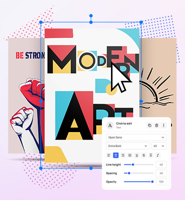
Visualize your design Use a product mockup to showcase your design

Create your design Use our templates to create delightful designs for any medium