The Ultimate Design Cheat Sheet for Students
The phrase cheat sheet can be misleading – most students don’t actually use these for cheating at all! Some professors refer to a cheat sheet as an ‘allowed reference sheet’ and it is a single sheet of paper that you are permitted to carry with you when you are sitting a test or examination. Many students carry the cheat sheet concept into other aspects of their lives, using written hints and tips to help them with facts and skills they simply don’t have the capacity to remember! And that’s exactly what this piece is intended to do.
Whether you’re a design student or simply a student from another faculty who needs help with project design hints and tips, here’s everything you need to know about the basic principles of good design in one handy page. It’s the ultimate design cheat sheet for all students. Because at Mediamodifier, we’ve done all the hard work so that you don’t have to!
Design Cheat Sheet for Color Theory
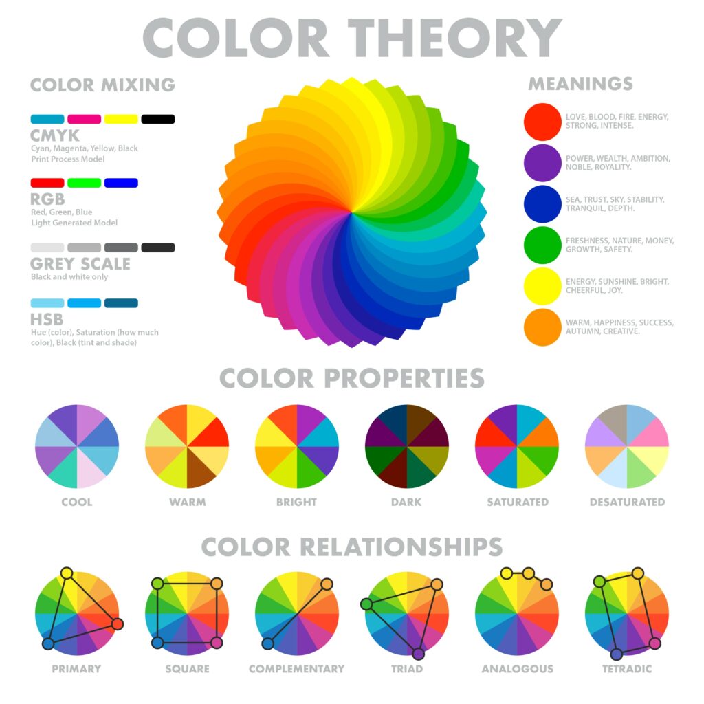
Not sure which colors will pair together best? Don’t worry, we’ve got your back! The colors you choose can either complement or contrast with each other, and each color pairing can have an impact on mood and frame of mind. This is known as color theory. If you have access to a color wheel then you will know that the colors from red through to green (that’s all shades of red, orange, yellow, and green) are considered to be warm or active colors whilst the colors at the other side of the color wheel (that’s blue and purples) are considered to be cool or passive colors.
Colors that sit directly opposite from each other on the color wheel are considered complementary colors, whilst those colors that sit next to each other are analogous. True red, blue and yellow are considered primary colors, whilst orange, green and purple are secondary colors. The other shades within the wheel are then referred to as tertiary colors.
Not sure which colors to use? Maybe color psychology could help! Red ignites feelings of urgency: it is a color that stimulates both the body and mind. Orange is often used to increase energy levels, whilst blue is considered a calming and soothing color.
Design Cheat Sheet for Typography
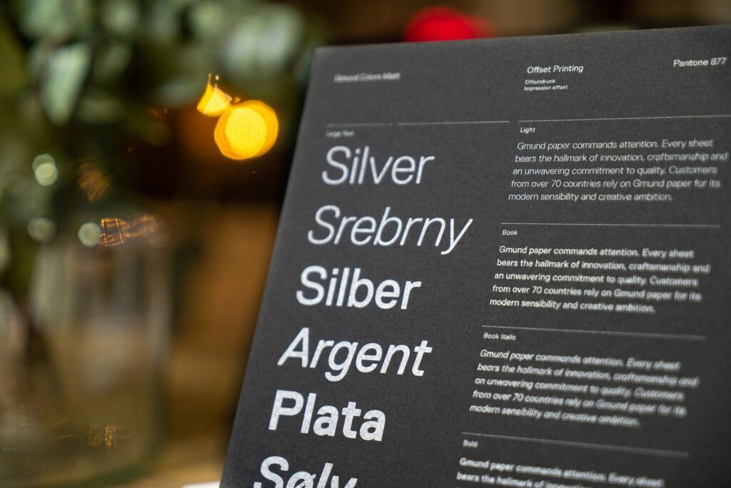
‘Which font should I use’ is one of the questions asked most by design students, and whilst much of font choice is driven by personal choice, there are a few handy cheats that you can adopt to help you work out which font will work best depending on the situation:
- Sans Serif are neutral fonts often adopted for the body of a text
- Italic Serif fonts are best used for quotations, to make them stand apart from the rest of your text
- Handwriting Script fonts add a casual and personal touch to your designs
- Black or Extra Bold fonts should be used for headings, or to make an eye-catching statement
- Script fonts are considered to be elegant, and are often used for formal occasions
Design Cheat Sheet for Knowing Your Terminology
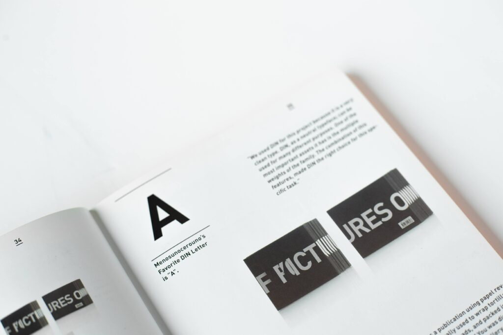
Finally, if you want to be a designer then as well as walking the walk, you have to be able to talk the talk! And this means understanding the terminology that is often used in the design world. Here is a brief breakdown of some of the key terms that you ought to know and understand:
- Typography. In brief, typography is the art of arranging the printed word so it looks good! The font, typeface and arrangement of your text will all fall under the typography header.
- Hex. When choosing the colours for your designs, you may be asked to provide the hex number. The hex number is a digital number, usually used in CSS and HTML, to identify colors. You will find hex numbers used within most design software, including within the Mediamodifier design tool.
- Logomark. We all know what a logo is, but if you’re asked to include a brand’s logomark then you need to know that this is the brand’s graphic or image-based logo without any text included. A bright yellow M without the word McDonald’s printed underneath, for example.
- Icon. An icon is a small image used in design to represent either an action or an object. Icons are often used to attract attention and to ensure a message is crystal clear to the audience.
- White space. Sometimes also known as negative space, these are the areas that are purposefully left blank within a design. White space isn’t always white, it is just space that is blank, and is often used to highlight other design elements.
- Blur. Blur is a design tool often used on the edge of objects or images. A blur will make an image look less distinct, and this is often used to blend an object or image into the rest of the design.
- Resolution. The resolution of an image is simply a marker for the quality of an image: the higher the resolution the better the image quality is. The best designs are those that use the highest resolution imagery.
- Cropping. Cropping is the act of removing the unwanted parts of an image or design. Most design tools will offer a simple cropping tool.
- Vector. This is a term that refers to images that are made up of curves, lines, and points. These images don’t lose any quality when scaled.
- Rule of Thirds. Finally, most designers are aware of the rule of thirds. This is a theory that dictates that if an image is divided with two horizontal and two vertical lines, the points of intersection of these lines, will be the focal points. Many designers follow this rule, so you will find a wealth of examples of this available.
Visualize your design Use a product mockup to showcase your design

Create your design Use our templates to create delightful designs for any medium
