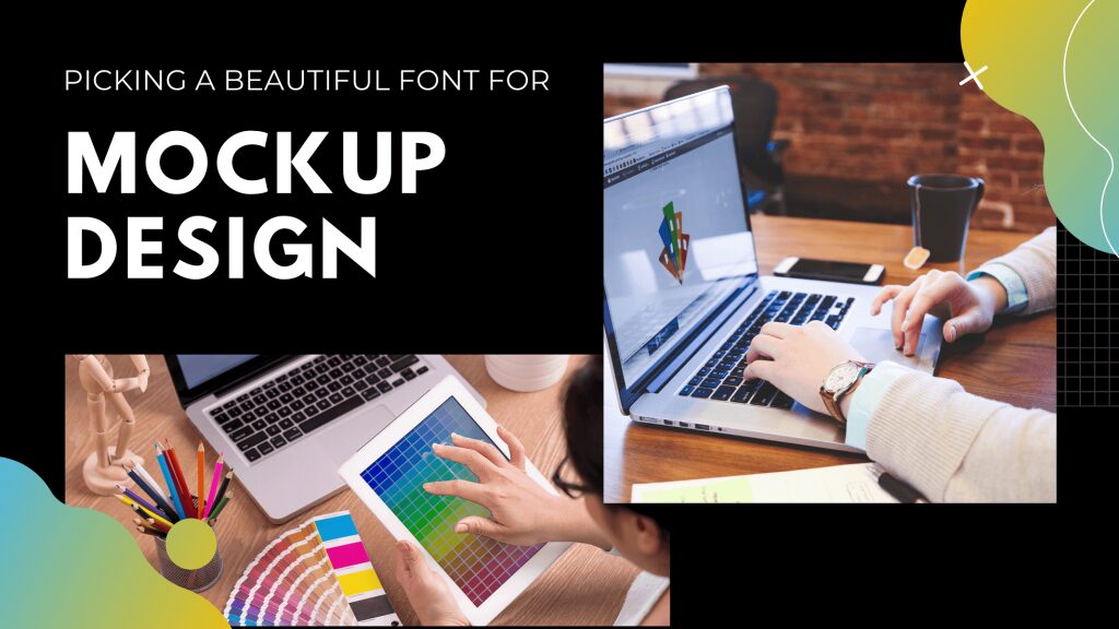
How to Pick a Beautiful Font for Mockup Design
Sometimes even the smallest things can make a huge difference, and the same applies for graphic design.
Going for a perfect font can make you a professional designer while choosing a lousy font for your mockup can spoil your entire mockup look.
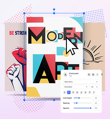
As a graphic designer, you might be acquainted with ‘Mockup design,’ which is an elaborated version of your entire mockup.
In simple words, Mockup design is the full size of your design, which is utilized for various purposes.
It demonstrates the accurate picture of your design or tells you how people perceive it when you make it public for the world.
Now here I am with another instructive article that will surely solve your confusion related to Mockup designs.
Let’s further tale measures with the topic and talk about the fonts that you should use or sort out for your Mockup design.
Picking a Beautiful Font for Mockup Design
Sometimes a minor fault in your mockup can make a huge collision. Even a non-graphic person can tell how essential fonts are for your mockup and what difference it makes when choosing the wrong fonts. Have you ever tried to change the fonts all of a sudden, and how great response you received in return?
Always remember that your choice of fonts is as important as what you do with it. Let’s talk about those essential points that demonstrate how to pick a font for Mockup Design.
1- Readability
The font size plays a significant role in appealing every visitor because if the fonts aren’t visible to them, then how they will acknowledge it. Hence always go for such fonts that are clear, visible, and understandable so that users don’t find any difficulty reading it.
Moreover, choosing a font with an inappropriate size results in losing a number of visitors as they prefer to switch to someone’s else mockup for better readability and apprehension.
To me, it is one of the first essential points that you should consider before picking a font. Before making a final choice think about different screens where your font will appear hence make sure to consider that factor too.
2- Serif and Sans-Serif Font
We have a bunch of fonts that we can use for our Mockup design. Almost every other site is based on Serif or Sans- Serif typeface incorporating Georgia, New Roman, Futura, and many others.
However, I recommend you get your hands on avenir font family a geometric Sans-serif typeface which is being utilized for the last 5 decades and is widely prevalent everywhere. It was developed by a designer ‘Adrian Frutiger’ in the 1987s, and since then, various new features have been added into it to make it more significant.
3- Compatibility Among Fonts
The compatibility or harmony among fonts is one of the essential factors that have a considerable impact on your site. In order to pick a beautiful font, you should make sure that either the fonts you have chosen for your designs are complementing each other or not.
Moreover, the Typography settings or updates keep on changing now and then so you should go for such fonts that would remain compatible with the modern Updates. Otherwise, you may face difficulty later. Testing is the ultimate solution in this regard if you want to check the compatibility then test the fonts on various devices to know the final results.
4- Be Selective in Picking Fonts
One of the primary mistakes that every designer does is choosing the standard fonts i.e., New Roman, Helvetica, etc. for their site every time and end up having an ordinary mockup. You are not bound to select always the same fonts as now you have thousands of options from which you can make the applicable selection.
Be choosy, take your time and decide it after a while when you are sure that a particular font will make your site look beautiful and engaging. Being selective in choosing fonts makes you a professional graphic designer.
5- Justification and Alignment
How you place the text on your mockup also matters a lot in this regard. The text that needs to be placed at the right should be in the right corner, while the headings that need to be fit in the center should be aligned in the center. Moreover, making large blocks of texts make your site less appealing. Hence you should take care of these little things when it comes to alignment and justification.
Importance of Fonts
A font conveys a particular message to the visitor. It depicts how the visitor will perceive your mockup based on font size, Fonts style, and font selection. The prominent font means that the higher chances of visitors visiting your site. Various fonts or Typeface have been emerged to choose a particular one according to the content you have made.
Not every font can go best with every content, so if you do not pay emphasis on fonts, you will end up losing visitors. A right type of font differentiates your font. It likewise develops consistency that comes if you keep a proper balance throughout your content.
For instance, if you have set a specific limit for your main headings, main content, or secondary page, you are bound to use the same settings throughout your mockup. These little things develop consistency among pages. I would recommend you prepare a whole worksheet where proper settings of fonts should be placed so that you won’t face any difficulty regarding fonts.
Conclusion
Having a perfect combination of fonts for the mockup guarantees to give you success. If you are unable to get the desired response, then analyze your mistake and try to solve it. As a graphic designer, you should be professional enough to know which font will go best for the mockup.
I have mentioned almost all the important points on picking a right font to let you get rid of the confusion regarding the selection of fonts. I hope you will find this article helpful and informative.
👉 Create your first mockup here and make every post unforgettable!
Related articles

Visualize your design Use a product mockup to showcase your design

Create your design Use our templates to create delightful designs for any medium