What is Minimalist Logo Design
We’ve all heard phrases such as “less is more” or “there’s beauty in simplicity”, but how exactly does that apply to design? The answer is the simple (quite literally): minimalism. For brands, the keyword is a minimalist logo.
Minimalist design can easily be described as design at its most basic form, lacking unnecessary elements, colors, shapes, or textures which do not add anything relevant.
The main purpose of this type of design is to make the product or content stand out by itself. From a visual standpoint, minimalist design is meant to be less overwhelming or stimulating to the brain, inspiring a state of calmness.
Nowadays, this kind of simple approach is preferred by many companies for their logos, and it is often seen as a symbol of professionalism. The trend comes as a reaction to the over-the-top designs and works of abstract expressionism.
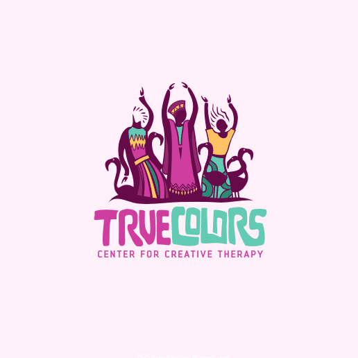
Instead of using as many colors and shapes, minimalism challenges itself to use as few elements as possible. Also, instead of trying to replicate the subject’s true form, it relies on the usage of symbols.
When taking a look at some of the most successful minimalist logos, you’ll notice that it’s an accomplishment to create an extremely simplistic logo. Sometimes it doesn’t even consist of more than one brush stroke.
A very good advocate for minimalist logos is the classic Nike logo. Known as “The Swoosh”, the iconic design is worth $26 billion. Even though the design is simple and not necessarily innovative, it is now probably one of the most recognizable elements in the history of branding.

Why is Minimalist Logo Design Popular?
The reason why many minimalist logos are effective is how easy they are to remember and recreate. If a logo can easily appear in your client’s mind, it reinforces the connection they have to your brand, which is less likely to happen with an overly complicated concept.
Another reason to prefer simple designs is the fact they can easily go on any products you might need them for: from websites and mobile apps icons to merchandise and printed materials, a simple (and sometimes monochrome) logo will be way less of a hassle. If you want to test different versions of your logo on different materials, Mediamodifier’s mockups are a good way to visualize it.

The Challenges of Keeping it Simple
One of the difficulties of creating a minimalist design is making sure that the elements harmonize visually. Since it uses fewer elements to begin with, it becomes rather obvious when an element is not balanced. This is especially true when the design uses white space to draw more attention to certain elements.
White space is practically synonymous with minimalism. Since minimalism constrains the use of colors, an extremely powerful tool in the hands of a graphic designer is contrast, which can be the key to creating an eye-catching element.
This strategy isn’t all that effective on a product or service with many colors already in use. For example, a very colorful website with a simple logo, which is why many opt for the usage of white space around their design.
Almost as important as the design itself is the font used. To fit the style, the font needs to be clean, simple, and easy for people to read.

In order to create the most effective minimalist logo, remember these key points:
- focus more on symbols than on an accurate representation of your subject
- make sure everything is balanced, which often also means symmetrical
- try to use as few colors as possible, and keep a neutral palette
- use clean and simple font styles
- make the most out of white space
- make your lines as clean as possible and always check your angles
- do not be afraid to use texture
- getting rid of any elements that do not bring substantial meaning to the concept
- consider how it would look when applied to services and products

Conclusion
Minimalist logo design is a good way to express your ideas in a very clean and direct way. In a world full of surplus and kitsch, a minimalist approach is a breath of fresh air. This timeless concept has been used in many ways in various eras throughout human history, and it is now a very important category of logos.
Related articles
Visualize your design Use a product mockup to showcase your design

Create your design Use our templates to create delightful designs for any medium
