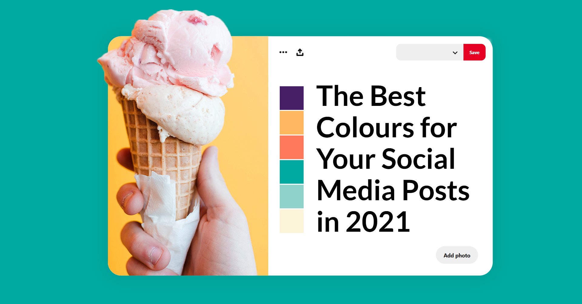
The Best 5 Colors to Use for Your Social Media Posts in 2021
2021 calls for a fresh start for obvious reasons and your social media should not be exempt from that.
It is essential to stay informed with the trends and apply them to your new posts, in order to maintain your relevancy. In this article, we will discuss which colors are predicted to be this year’s trend and why you should use them.
Colors affect the way people perceive your brand and it’s scientifically proven that different shades can bring different moods to your content, based on the historical and general associations with that color.
For example, the color red is considered an eye-catching and passionate color that asserts dominance and establishes power, while brown is an earthy color sometimes perceived as dull and unsophisticated.
These meanings can be manipulated based on the accompanying colors and other elements used in your posts.
Here are our top choices:
1) Yellow and Grey
The highly-anticipated moment of Pantone announcing their color of the year for 2021 came with a surprise: this year it’s a combination of two.
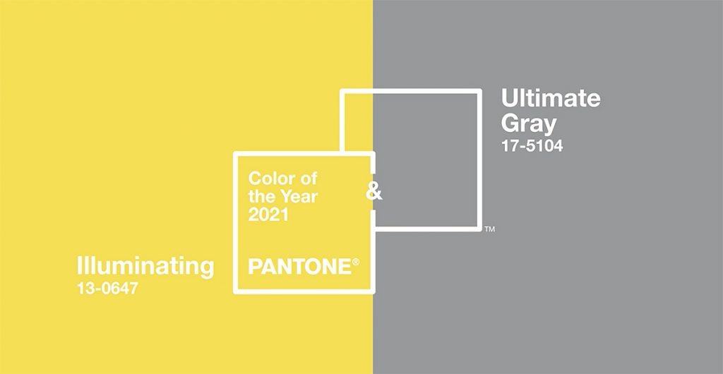
The PANTONE 13-0647 Illuminating and PANTONE 17-5104 Ultimate Gray create an uplifting yet fresh and clean combination to use in your social media visuals.
Chosen as colors that complement each other to symbolize the hard times of last year, yellow and grey are long known to be a great pair and these two shades work together perfectly.
2) Teal
Aegean Teal is a mid-tone blue-green shade that brings harmony and elegance whilst symbolising hope and trust.
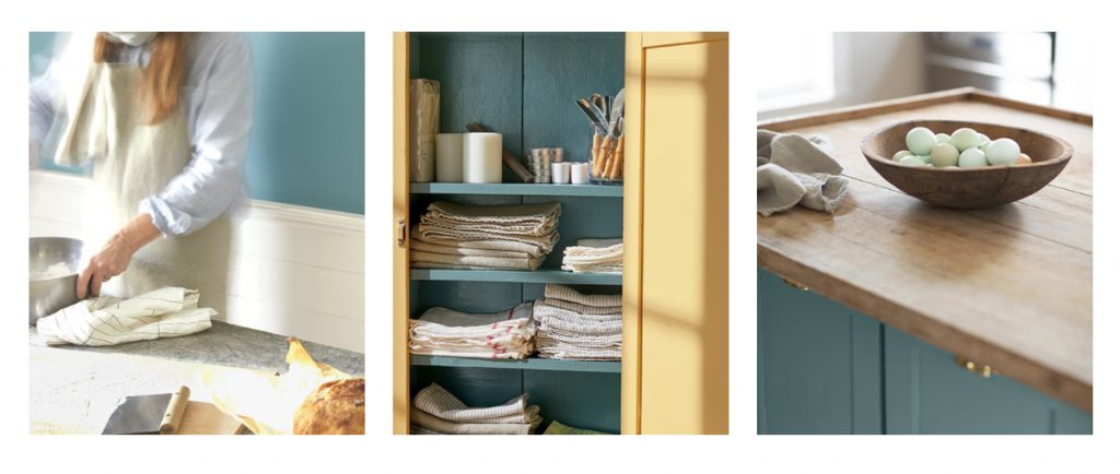
Encouraging creativity and balance, it’s a great shade for businesses who want to inspire these values.
Being a classic spring color, you might want to incorporate teal into your early March posts, to subtly send a message of prosperity and renewal regarding your services or products.
3) Black and White
The black and white themes are making a comeback (not that they really ever left) because of their simplicity and clarity.
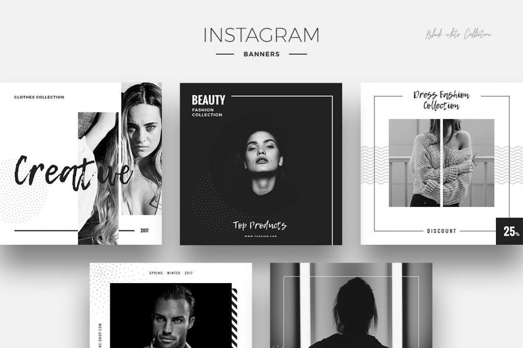
The timeless classic is always a good idea to consider for your posts, as it will look clean and professional no matter what.
Black and white have generally been used together as a staple for text-heavy visuals since it’s one of the most eye-catching templates, despite the lack of color.
Moreover, the combo’s popularity has also surged in recent years in the form of photograph filters.
4) Pink
Pantone has listed their shade 17-1926 Fruit Dove as another trend for 2021, and it’s not hard to see why.
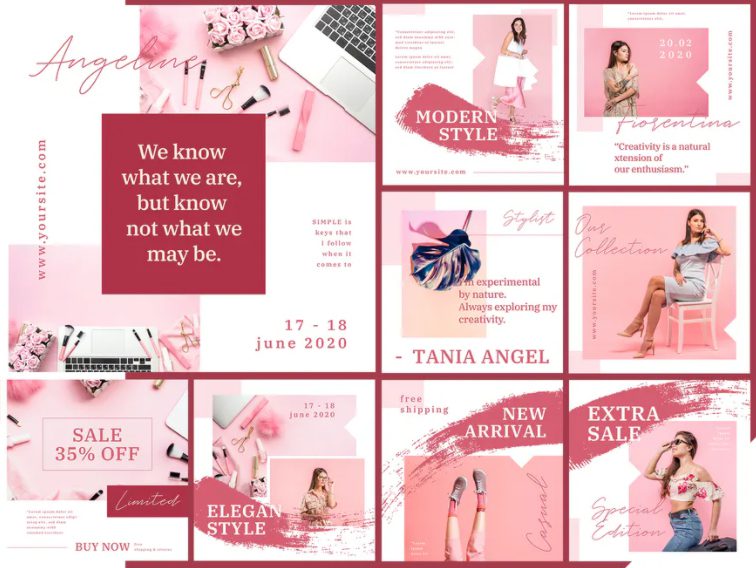
Pink has dominated social media for years now and it’s not planning on going anywhere. This shade is a gorgeous muted medium pink with a purple undertone manifesting playfulness, ideal if you want to switch things up and hop on the pink trend.
Pinks can be combined with yellows and greys for a more feminine style, but they can also accompany dark greens, blues, or browns for a more neutral approach.
5) Green
Last but not least, neutral shades of green are predicted to be very popular this year. Combine darker and lighter shades for a relaxing monochromatic look.
Being mostly associated with money and nature, green presents itself as a symbol of wealth and stability. Brands have been jumping on this trend more and more since it also creates an association with more eco-friendly initiatives.
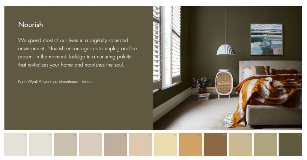
Warm neutrals with green (and yellow) accents are also predicted to be a winning combination of 2021, being pushed by several interior design or paint companies, which are known for being trendsetters whose influence spills into the online world as well.
The bottom line
At the end of the day, any color can be used for your social media, as long as you try your best to create the right palette. It’s important to stay true to your brand and utilise colors from your branding guide, whether it’s as the main focus, or as accents, but don’t shy away from experimenting with new styles.
For a harmonious look, stick to a couple of shades throughout your posts, and try to coordinate so that their undertones match. This is particularly important for platforms such as Instagram, where the pictures need to come together as a whole in order to create a pleasant visual experience in the form of a unified feed.
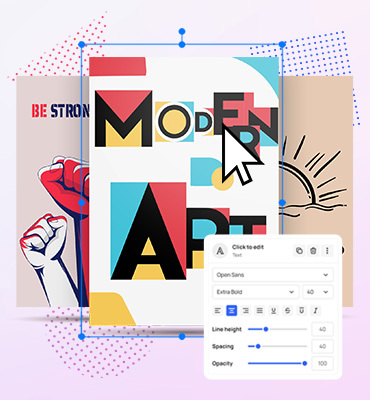
You can create your own Instagram or Facebook posts using Mediamodifier Design Templates or create them from scratch using your preferred trendy colors.
Related articles
Visualize your design Use a product mockup to showcase your design

Create your design Use our templates to create delightful designs for any medium