5 Principles of Psychology You Can Use to Improve A Design
The impact of good design should not be underestimated. After all, a bulky block of text isn’t going to attract the attention of your customers, no matter how attractive the message is. But there’s more to good design than simply adding plenty of colors and eye-catching imagery.
Adding a few psychological tricks in your design as well can help you to capture and hold the minds of your potential customers, without them even noticing that you’re doing it! With that in mind, here are five principles of psychology you can use to improve a design right now:
1. Understand the Psychology of Color
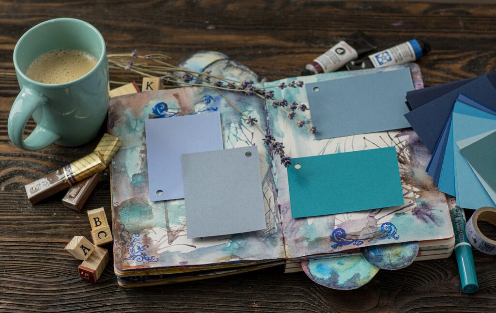
The colors you choose in your designs are incredibly important because different colors subconsciously awaken different emotional responses.
Red, for example, is a color that is associated with strong and passionate emotions while blue is considered calming and restrained. Green and purple are popular in advertising, with green creating feelings of renewal, and invoking thoughts of nature, while purple is a regal shade that is associated with both wealth and magic.
Arming yourself with this information before you start working on your design will help you to ensure that the color palette you choose sets the right tone.
2. Seven is the Magic Number

‘The magic number seven’ is a psychological phenomenon cited by cognitive psychologist George A. Miller. This shows that the average human brain can only hold seven pieces of information (plus or minus two) in its short-term memory at a time. You can use this information to improve your design by streamlining it to ensure that you aren’t bombarding your potential customers with too many stimuli.
Organize the information you want to include in your designs into no more than seven chunks or sections, and your potential customers will be much more likely to retain the information that you are sharing. Consider images, headlines, and any facts or prices within this selection of seven pieces of information.
3. Apply The Cocktail Party Effect

The cocktail party effect is a psychological theory that is also known as selective attention. In short, this is the ability to focus on one stimulus while filtering out other surrounding stimuli (in the same way that you can hear your own name being mentioned in a cocktail party, even if you’re surrounded by other, louder, conversations).
You can apply this to design within your marketing campaigns by ensuring that, where possible, they are personalized to include the name of your customer or client. By addressing them directly, you are much more likely to attract their attention to the rest of your design.
4. Avoid Sensory Adaptation

Sensory adaptation is a phenomenon that sees humans tune out a stimulus that is similar to another stimulus they have recently been exposed to. In design terms, this means that (for example) if you repeatedly use blue headers on a blue background then ultimately your readers will become blind to those headers.
In short, if you use the same colors over and over again in your designs then people are hard-wired to tune those features out. Avoid this by ensuring that your call to action stands out in bold colors and fonts that will be impossible to miss.
5. Be Part of the Crowd

While we want to think of ourselves as unique and individual, the vast majority of us are most comfortable when we’re following the crowd. We’ll ask our friends what they’re wearing before we go out together, for example, or what they’re going to eat in a restaurant. We care about other people’s decision-making, and this often impacts our own.
The group psychology of this can be harnessed and utilized in the design, particularly in website design. Including peer reviews will increase brand confidence, sharing links to other items that customers have looked at or purchased instead will also positively impact sales uplift: let your customers know that they aren’t alone in thinking your product is great! Incorporating this kind of subliminal messaging into your design shows that the site is popular, and in turn increases user confidence.
Innovation is fun and exciting: but in reality, most of the details that designers agonize over simply aren’t important to the average consumer. In addition to your favorite font or the imagery that best suits your brand identity, focusing on these small psychological tricks is likely to improve a design and lead to additional views, and therefore more conversions.
For more design tips and inspiration, check out these articles:
Visualize your design Use a product mockup to showcase your design
Create your design Use our templates to create delightful designs for any medium
